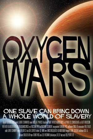
Entertainment Marketing & Design encompasses anything that is required by an entertainment property or brand to promote itself to its audience. That could begin with a logo for that property and extend to key art for use in collateral such as posters, DVD slipcovers, press kits, brochures and anything else that might be necessary. This can apply to small or low-budget productions as well as large campaigns.
These four poster samples are rough comps or mockups based on four of my screenplays. I use them as examples of the kind of range that is required in good entertainment marketing and design. A comedy calls for a lighter approach to its design whereas a thriller or horror film calls for something edgier and more lurid. FOUR SHADES OF BLACK is an action horror film and the eventual real key art would most likely use photographic elements of the lead actor, manipulated along the same lines as this drawing has been manipulated to achieve this effect. The actual image for the DOS & DON’TS poster is a blend of my own illustration over a stock photo as the foundation of this graphic. The real key art would again ideally use photographic elements, shot during production using a still camera (not grabbed stills from the footage) that would convey the premise of the film. The actual key art could be shot in a limbo, in a photo studio, or it could be of the lead actress on the street, caught in action.
One of the things I hope to show with these samples is what I refer to as the boldness or legibility that is required by key art, whether it’s used in a poster, a DVD or book cover or whatever. All of the graphic elements—the logotype, the copy, the graphics—have to work together to provide one clear communication. The worst examples in entertainment marketing are those you’re undoubtedly familiar with (from your visits to the video store) wherein the marketing department has tried to cram every piece of data they consider to be crucial to the success of the film into the poster or DVD cover. Because of that you start to see some recurring design motifs, such as the large heads, shot in three quarter profile, lined up in an row. A new variation of that is half of the lead’s faces with the noses cut down the middle by the left and right edges of the poster, respectively.
If you are a film producer looking for good entertainment design for a project that does not have name or known actors, you can still get good and compelling marketing materials. While it’s an old and tired notion that if you have a movie star in your movie you should show their face on your poster, that does not always guarantee good box office, particularly if your key art doesn’t convey the premise (not the story) of your film.
Think back to the poster for Stanley Kubrick’s THE SHINING, designed by my hero, Saul Bass. It consisted of a yellow background with the centered logotype, “THE SHINING” in bold, black and rough hewn hand-lettering. A very basic illustration of Jack Nicholson was stripped into the black lettering—not a photograph. I’m sure Nicholson’s and Shelley Duvall’s names appeared on the poster as well, or at least some version of the posters. But this is an example of an entertainment key art solution that was almost pure design.


